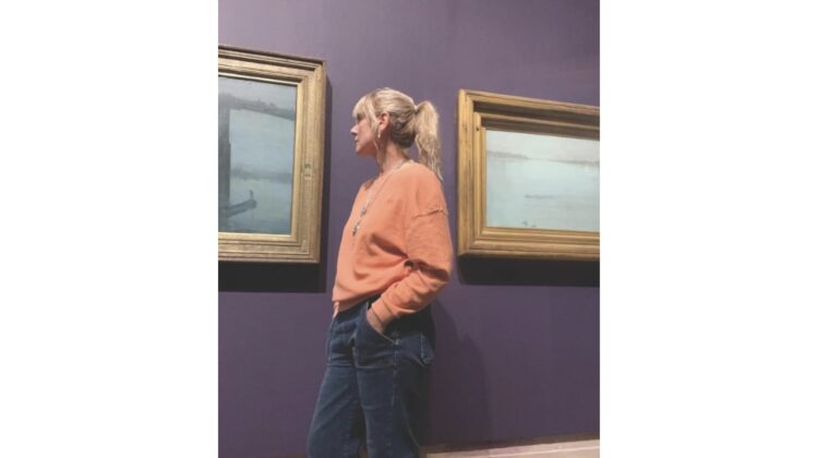
For this month’s art appreciation column, Suffolk-based artist, educator and co-presenter Grace Adam looks at the colour blue in art
All those blues…The colour of the sea, the sky, Michelangelo’s ceiling in the Sistine Chapel, murals in Pompeii, aquamarines and sapphires. Blue is associated with divinity and wealth for millions of humans. 9,000 years ago, lapis lazuli was first mined in Afghanistan. Its beauty and rarity meant it was traded and treasured in China, India, Mesopotamia and Egypt; the ancient Egyptian world believed it contained the souls of the gods. It was once more expensive than gold.
Lapis arrived in Venice for Renaissance patrons and painters (or those who could afford it) to turn into Ultramarine. Precious and mystical, unlike ochres and reds, it can’t readily be dug up and ground into pigment.
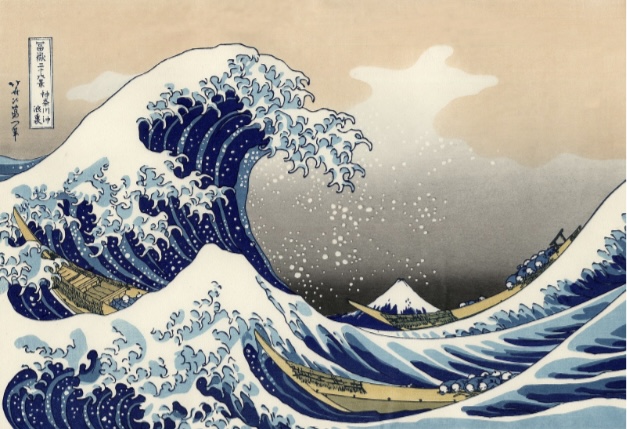
Dye producer Johann Jacob Diesbach invented the synthesised pigment Prussian Blue, a cheaper alternative to lapis lazuli. The new pigment travelled from Germany to Japan and colours Hokusai’s Great wave. The giant blue wave holds three boats and almost obscures Mount Fuji in the background.
The Great Wave off Kanagawa Katsushika Hokusai (1831)
As late as 19C, that medieval favourite Woad was shipped out from the Port of Wisbech, and in the early 1800s, French chemists invented Cobalt blue and Cerulean blue – bright, cheap and reliable. Impressionists knew a good thing when they saw it.
Nocturne Blue and Gold, Old Battersea Bridge James McNeill Whistler (1872-1875)
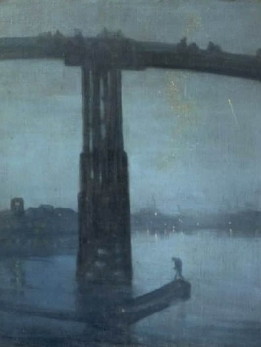
This is part of a series Whistler painted which he called Moonlights, but his patron Frederick Leyland thought Nocturnes with its association with music more suitable, and it stuck.
A limited palette of colours bring indistinct shapes looming out of the fog. Whistler believed that painting should be ‘like breath on glass’.
The old wooden Battersea Bridge towers over a standing figure in a boat. Industry fills the horizon, along with the bulk of Chelsea Old Church. Somehow the artist manages to convey a sense of calm with the lapping waters of the Thames. He was influenced by Japanese prints which were becoming popular in Europe and was a big fan of Hokusai.
The Nocturne series achieved notoriety in 1877, when influential critic John Ruskin saw the works in an exhibition and was outraged that Whistler was ‘asking two hundred guineas for flinging a pot of paint in the public’s face.’ The case concluded with the artist being awarded just one farthing in compensation for libel.
IKB 79 Yves Klein (1959)
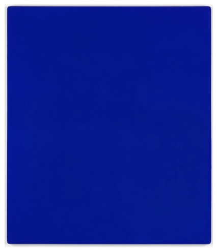
How audacious to invent your own colour and to name it of course, after yourself. Klein developed a shade of pure ultramarine which he trademarked. International Klein Blue: a pure colour powder in a lightweight, virtually invisible resin. He went on to create 200 strange searing very blue canvases. For Klein, blue was ‘the invisible becoming visible. Blue has no dimensions; it is beyond the dimensions of which other colours partake.’
A Bigger Splash David Hockney (1967)
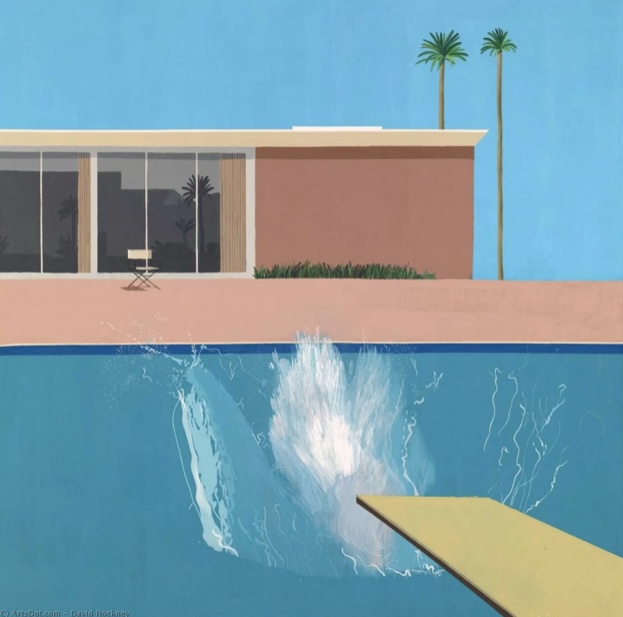
David Hockney’s seductive image of fabulous free ‘60s Californian life comes with a huge splash of Cobalt and Ultramarine. Tall Palms, an empty chair, and a cloudless sky give us heat, modernity and luxury. The glass of the cool modernist house reflects the neighbourhood skyline. That splash which in reality would have disappeared in seconds took him an age to freeze onto the canvas.
I never get tired of the blue sky
Vincent Van Gogh
Grace Adam is an artist, educator and co-presenter on d co-presenter on The Art Channel. Visit graceadam.co.uk.


What a fascinating article, Grace Adam. I very much enjoyed your tangle of blues and related paintings. I have a new appreciation for James Whistler – that is an extraordinary piece of work.
Good history of blue and excellent choice of images. I think I’ll send this one to my students
Indeed as Klein says blue has no dimensions! I always gravitate to blue and its endless possibilities and depths. Thank you for the thoughtful insights as always